At today’s IUG form on Data Analytics and Transaction Retention there was a request for folks to share examples of data visualizations they have built in order to provide some inspiration for others. Here are a few of the hopefully more interesting examples that we have built in Minuteman, but I’m hoping others will be willing to share theirs as well. These examples are all built using Looker Studio.
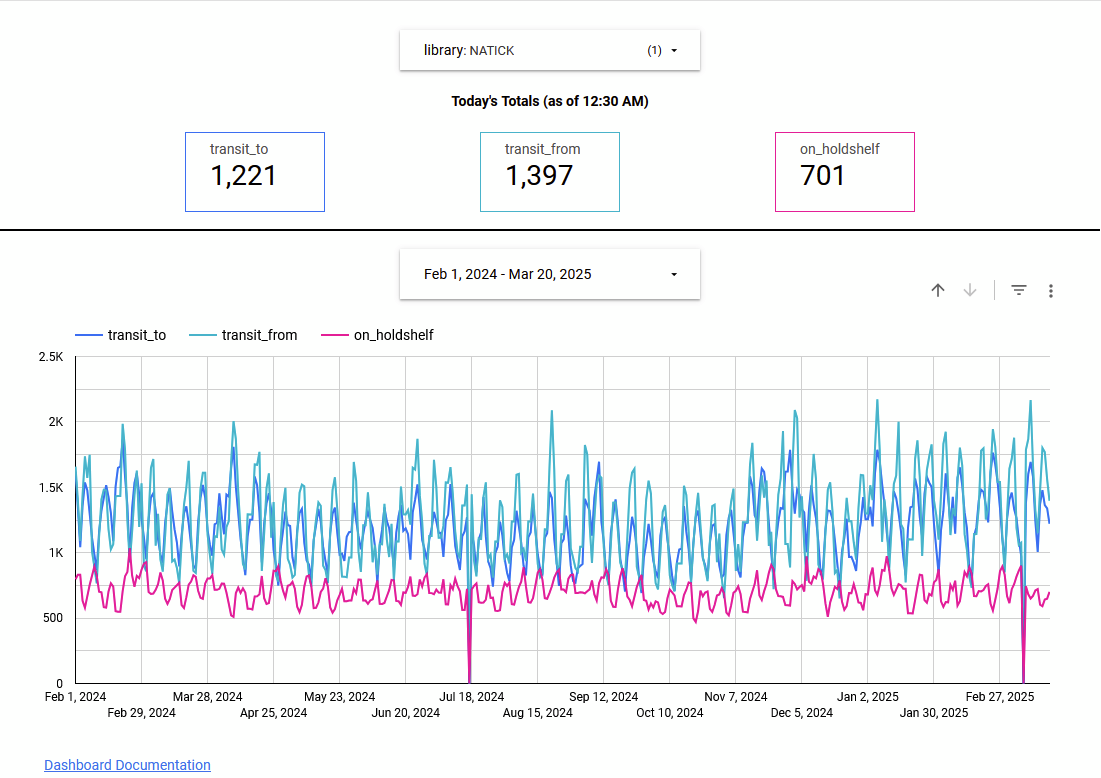
Daily Snapshot of items in transit and/or on the holdshelf
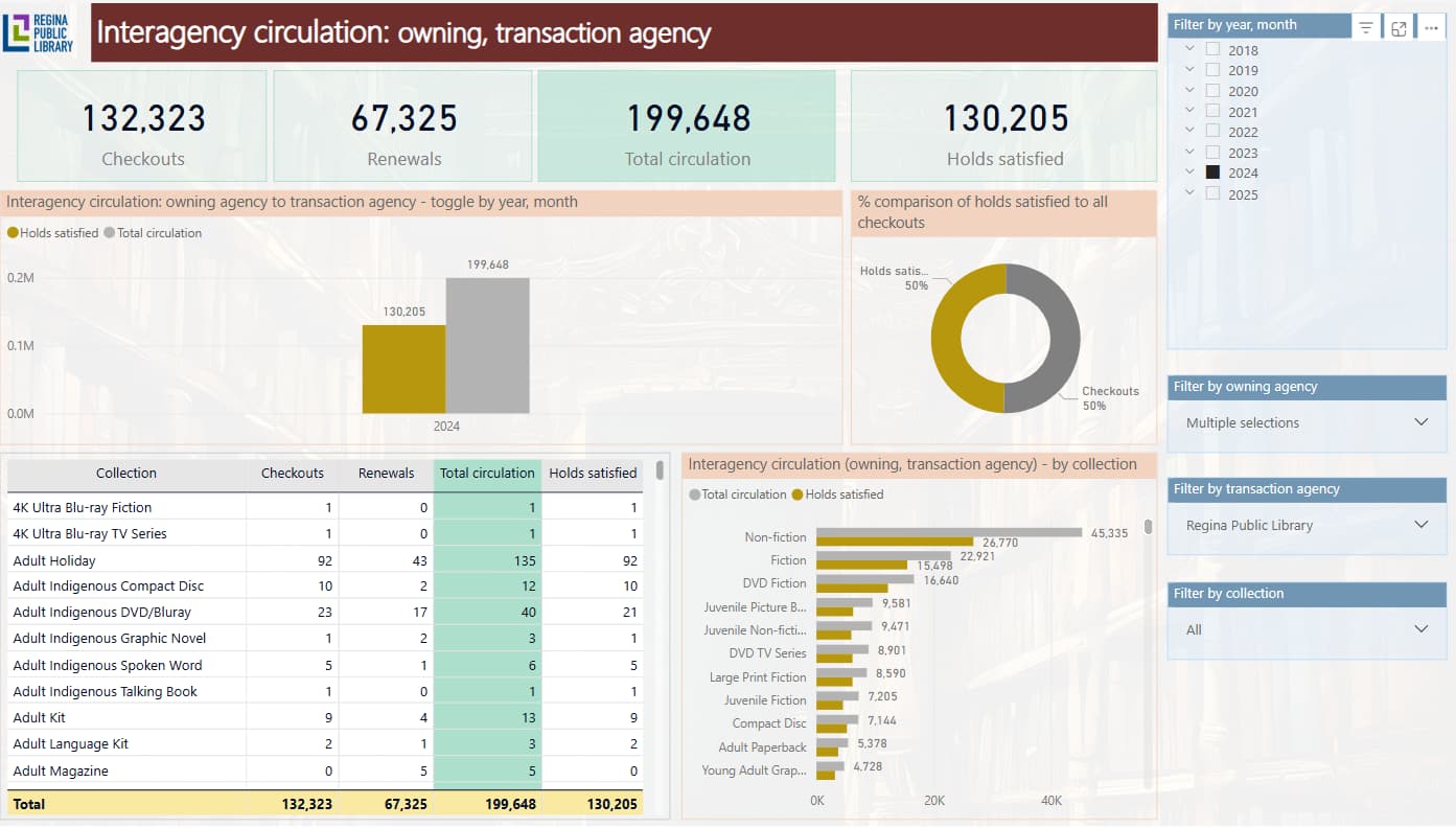
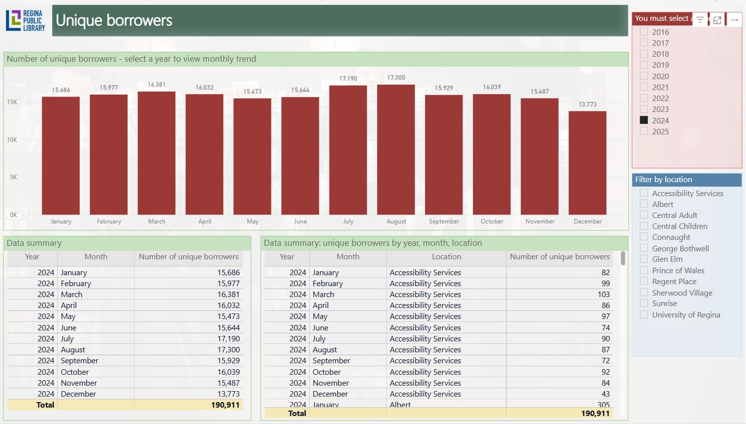
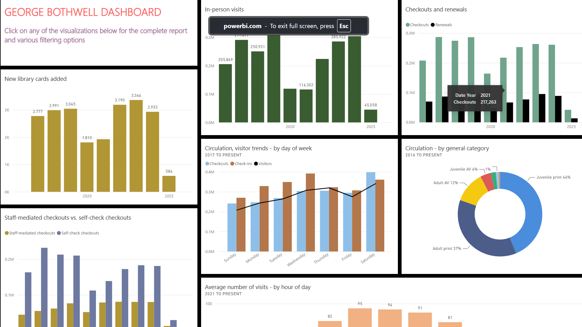
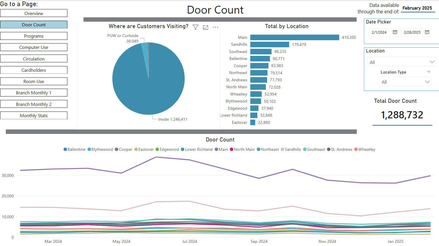
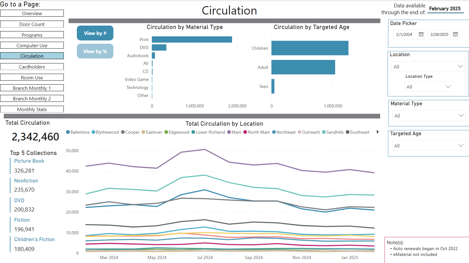
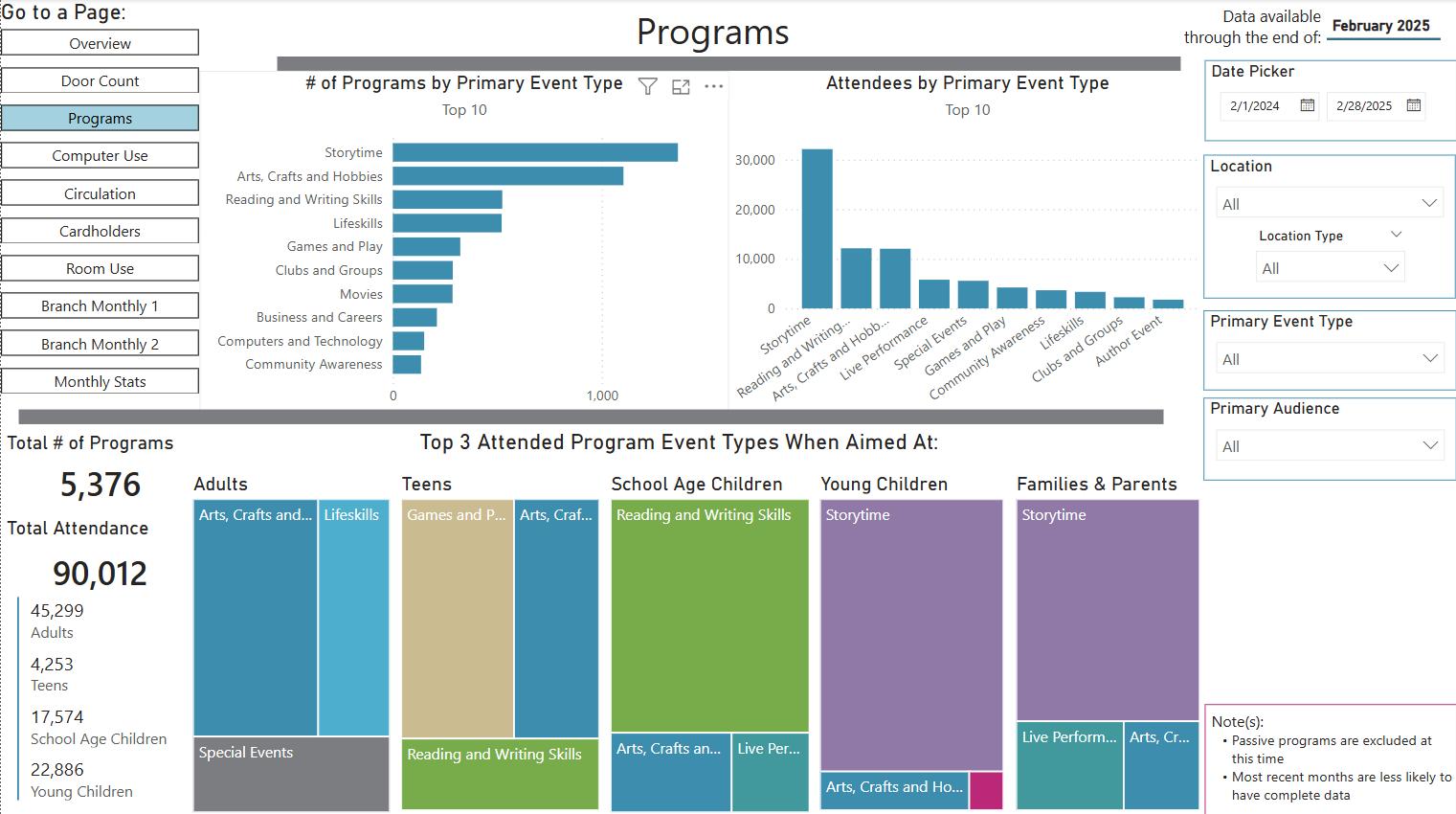
Too bad I couldn’t be at the Zoom session today! But I can share some screenshots from what we do. These are from PowerBI (which is our institutional reporting and visualization tool). We report on everything from occupancy, to program attendance, to wireless usage, to printing, to circulation data, to incidents. Most of our reports include filters that staff can use to narrow things down by year / location / other aspects of the report. A few are pure visualizations.
I’ll post just a few:
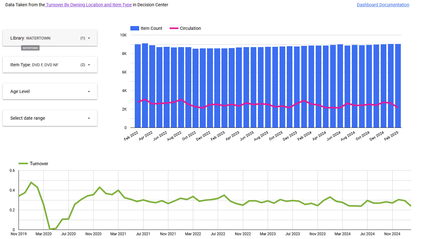
Interagency Circulation: Owning vs. Transaction Location
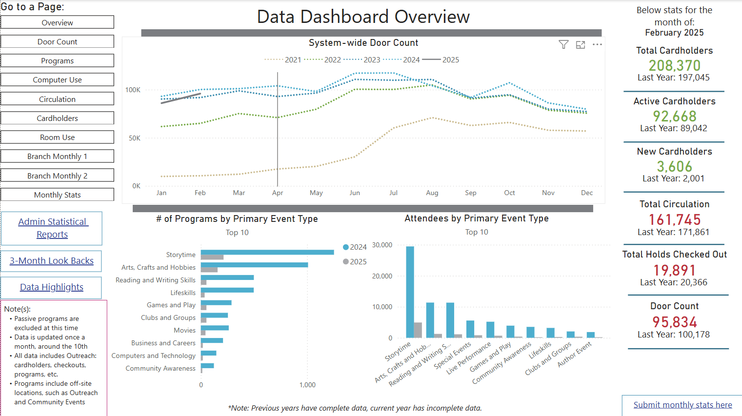
I’m going to call mine a “minimalist” style. Since this is something all staff see, I tried to make a balance between what I thought would be useful vs information overload. Ours isn’t real-time, I update this once a month.
Dashboard Overview
This page isn’t actually what’s current, this is what I’m going to update it to in the next month or so after a few more tweaks.
This is a very digestible dashboard, something I think would be appreciated by our Board. So this is using Polaris data (we are a Sierra library)? And Power BI? I didn’t realize the forum was yesterday, otherwise would have attended. I appreciate you all sharing on the forum…
Thank you! Yes, this uses Polaris data - however, it doesn’t connect directly to the ILS. The data shown in the dashboard pulls from an Excel file that I update using exported data. And yes, this is made in Power BI. We went with them instead of Tableau or another software because we’re already a Microsoft-heavy system.